While building a project or a company, one of the first questions that pops into our minds is: How is it going to look like? How do I want the brand and its values to be perceived?
Well, to make sure you have total control over how your brand is distinguished from others and to give it personality, avoiding plagiarism and counterfeiting, the first step is always building a corporate visual identity and tailoring the brand’s image.
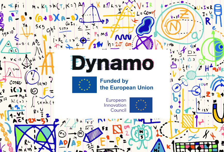
A corporate image has been created for Dynamo that contains all the values we want to express through the brand. This image is built by combining 7 different aspects that make the brand not only look attractive but represent the culture and values of the organization: technology, integrity and transparency.
1. Logotype: Typographic visual element that gives the name to the entity.
![]()
2. Design and implementation: We have also designed how the logo would be implemented in different colors, positions and styles.
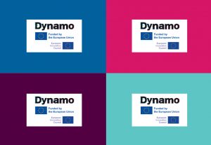
3. Color: Definition of color use in a brand creates a scenario of specific emotional values The main colors of the Dynamo logo are blue and pink.

4. Typography: The corporate typeface to be applied in the different texts for Dynamo’s documents is from the font series Roboto. This font has to be used in every corporate document.

5. Incorrect uses: Defining incorrect uses will help to avoid situations that can affect how our brand or company is perceived by others or even lead to miscommunications. It is key to maintain the logo composition and avoid applying any color other than its own to the image.

6. Applications: It is also helpful to represent how our brand is going to look like in merchandising or other products.

7. Illustrative style: Illustrations and motion are created based on continuous line strokes with a fine and elegant thickness with a gradient that maintains the corporate colors.
In addition, we have also developed a brand persona specifically for this project, that personifies the company’s values and acts as a transmission vehicle for the scientific messages, sometimes not easy to understand for the general public without a scientific background. A brand persona, thus, gives “shape” to the collection of tangible presentations or “touchpoints” your company puts out to the world as well as all of the intangible elements.

The brand persona we have created for this project is Dynamo. Since Dynamo is a presentation clicker remote with a laser pointer, it represents both the technological and academic characteristics of the company. Its rounded shape contributes to the public perception of friendliness and kindness. As a distinctive feature, Dynamo shows heterochromia in its eyes, integrating both red and blue distinctive colors, as a result of the light passing through the crystal in Dynamo’s research. By using this character on the website, social media and communication actions, it can guide and help the user to understand interfaces, dissemination messages or even make the brand more recognizable.
How do you like the strategy used to build Dynamo’s branding and corporate identity? We read you down in comments!